

articles/Nature/verysharppractice
Very Sharp Practice
by Mike McNamee
Don't Try This Unless You Are Serious!
graphSharpening remains contentious. We wrote on the topic in June last year and issues are still rumbling around. On a personal level only pre-sharpening of RAW files has been employed, followed by letting the Epson/Photoshop drivers and interface perform scaling of the image. This, we realise, is not 'best practice' but no complaints have been heard from any judges for images printed at 16"x20". We follow a similar practice for Professional Imagemaker pages and images.
If a photographer provides images we usually convert them to CMYK, change the resolution to 300ppi and then save a TIFF file without any additional sharpening. This is placed into InDesign and scaled to fit the layout, allowing the InDesign engine to transform the size 'on-the-fly'. Again no issues have been raised, other than a some pre-flight warning for 'low resolution'.
Low-resolution warnings on pre-flight are flagged when the effective resolution of the image on the page has fallen (because of scaling) to less than a set value (usually 250ppi). This almost invariably occurs with adverts provided by companies who do not employ professional design studios to prepare their advertisements (in the last issue, a value of 76dpi was used at one point).
Sometimes the scaling of an image to a double page spread causes a low-resolution warning. In this situation we will either obtain a higher resolution file, use a different image or perform careful scaling (using Genuine Fractals) sometimes followed by careful sharpening and, if required, proofing at full size. This, best practice, we usually employ for the cover shot.

Martin Evening and Jeff Schewe have written extensively (and very well) on the topic. Their 'best practice' is to pre-sharpen from RAW and then apply a second, 'output' sharpening according to the device, and size of print. This is indeed good practice for 'best' work, but may not be needed for run-of-the-mill album and wall-portraiture work. There is a difference to what you do for this and what you might do for your 16"x20" Convention entry. This is not to encourage sloppy work, it is about fitness for purpose; you may not want to sharpen an image just after you have softened it to a dreamy, mood shot!
Aside from these issues there is the perennial question, 'what is the correct level of sharpening'. This is an unanswerable question, it depends upon lots of factors, including some, or all, of the following: the viewer's eyesight*, the viewing distance, the print size, the paper surface, the illumination level, the subject properties (eg a bird's feathers or a model's skin) and finally the taste of the viewer. A neutral response to an image is probably the best measure of success.
If a group of judges are viewing an image and sharpening is mentioned it might well mean 'too sharp'; it could also mean unsharp! By a neutral response we mean that none of the judges says anything, suggesting everybody is concentrating on the image and issues of sharpening are not under consideration. Obviously a grossly over-sharpened image with haloes around everything is flawed and will probably be viewed as such by all present.

One viewer said that they could not detect any difference in a test matrix, whereupon we suggested they use the reading glasses they had suspended from their neck. What was interesting was the fact that this viewer did not seem to consider it important to wear their reading spectacles to complete the task, whereas we assumed that they would - in many ways both of us were at fault!
Judging sharpness can only be truly carried out on a print, for that is a tangible thing. A screen image is a variable, very evident if the same file is viewed on a number of different monitors. When carrying out the tests for this feature we had images which looked soft on the CRT but massively over-sharpened on the LCD alongside - the same image simply dragged across from one screen to the other.
This is an issue for digitally projected or screen-viewed competitions, over-sharpening is a common complaint from judges but under-sharpening also crops up quite regularly. Much of it is outside the control of the photographer!
As far as we can tell from a limited Google search nobody has done a correctly balanced trial to discover the 'preferred' amount of sharpening. We found a number of esoteric articles on Google Scholar but all requested money ($30 to find we had no interest in sharpening goofy images from outer space was unattractive) , so we decided to do one ourselves (admittedly a slightly flawed piece of experimental design, but an attempt all the same).

Test 1
The first test was to pre-sharpen in Adobe Camera RAW - only. This is an attractive proposition for a busy photographer as the sharpening is applied once only and can be applied to all images in a set or folder. It has the advantage also of being reversible as it is applied to a RAW file. The workflow is akin to shooting JPEG and passing the files right off to press or to album printing. Martin Evening has published settings as shown below.
We took the 'detail' settings as being appropriate for the bird subject and applied them at progressively stronger and stronger values before making a composite print without performing any interpolation. This was then printed at 360ppi using 2880dpi, High Speed off and Max Detail on an Epson 3800 printer, ie the best conditions we could muster. The composite print was then presented to 50 photographers experienced at viewing prints, and they were asked to vote which was the 'most pleasing' level of sharpening.
In addition, the print set included a further group of images sharpened using the default 'detail' settings but with varying levels of Clarity applied in ACR
Only one out of the 50 went for the unsharpened image, the remainder went, in rising numbers, for the pre-sharpened values (without any Clarity), in rising order of strength. The highest vote was gained by values of 150 Amount, 1.5 Radius and 80 Detail. As the graph shows, the graph did not tip over into 'over-sharpened' territory, a flaw in the experiment.
We expected Clarity to influence the result because negative Clarity softens an image and positive Clarity seems to produce an apparent increase in sharpness - it increases mid-tone contrast. Our viewers were not fooled! Any amount of Clarity drew a few more votes over the baseline, but not a significant jump. This was unexpected, but statistics do not lie (really?).

Test 2
Test 1 showed some flaws in our experiment so we went back and re-organised the tests. This time we applied the three levels of presharpening followed by Martin Evening's recommendations for 'inkjet post-sharpening'. This was carried out using the values and methods from the PixelGenius software but we wrote our own action script to carry it out. A matrix of 12 images was made using three levels of presharpening and four opacity levels of 'PixelGenius' sharpening (see callout box). These were then presented to our viewing group.
RESULTS
To test the sharpening levels we again consulted a group of experienced photographers, showed them a matrix of images and asked them to vote for their preferred choice. Although they were unaware of the settings, they were in fact three levels of presharpening followed by the PixelGenius settings for pre-printing sharpening but presented at layer opacity levels of 0%, 30%, 66% and 100%. The viewers showed a preference for the images with IDs 5 and 6. That is higher pre-sharpening than Martin Evening but lower opacity on the High Pass Layer (ie 30% preferred to the nominal 60% specified by Martin Evening).
One interesting interpretation of the result is that the viewer's sensitivity to the overall level is quite mild (ie insensitive). Note that on paper, bumping the Amount from 80 to 150 and the Radius from 1.0 to 1.5 may seem a lot, but both received similar preference scores. In both cases, the image looked over-sharpened at 300% zoom view but had obviously turned out about right in print.
A question that arose from this finding was just how much sharpening is being applied by the photographers who enter competitions with massively over-sharpened images and why they do so? Should they be wearing spectacles (or if they already do should they be using their 'readers' rather than their varifocals)?

Before and after sharpening
At the time of writing, this is looking like a topic that will run and run, we do not anticipate having seen the end of it yet! If you are bugged by a sense that you are not as sharp as you might be, start with the values from samples 5 or 6 in the table then print a few shots with opacities ranging from say 20% through to 80% and take a look at real, full-size prints.
Once you decide on some values, write an action and run with it for a period of time and see how you get on - modify only on the basis of looking at prints.
All that has been written on the previous pages has little bearing on preparing images for digitally projected competitions or website use. Here we defer to the work carried out by Italian professional wildlife photographer, Juza (see www.juzaphoto.com).
Juza keeps a website populated with images of superb technical quality, especially in regard to their sharpening. He also details his preferred workflow for creating web images. It is a two-stage process, stepping down from camera resolution to 2,400 pixels and then to 1,200 pixels with inter-stage Smart Sharpening.
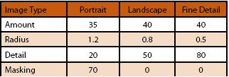
We modified his methods in line with a desire to end up with a 1,400 pixel image for digital competition. We presharpened in RAW as before, then reduced the scale to 2,800 pixels using Bicubic Sharper as the interpolation method. We then sharpened using Smart Sharpen (see table) followed by another reduction to 1,400 pixels and a lower level of Smart Sharpen.
This was followed by a 'Save for Web' routine to create a JPEG file, tagged with an sRGB profile. This final file was then compared with a RAW pre-sharpened file that was scaled directly to 1,400 pixels using Bicubic Sharper. The screen grab below indicates the results - which were visible on the monitor, but might not show up in print.

B.P.P.A. LIMITED
The Society of International Nature and Wildlife Photographers (SINWP)
Clwyd Chambers, Clwyd Street, Rhyl, Denbighshire, LL18 3LA, UK
Company Reg 0392 2894 | VAT number 790 4289 05
Tel: 01745 356935
Corporate Partners


Newsletter: Subscribe here
SINWP Bird Photographer of the Year
London Photography & Video Show - Europe's Largest 'All-Welcome' Photographic Convention | Partner Societies | Privacy