

articles/Landscape/themonochromespecial
The Monochrome Special
by Tom Lee
"In essence it is about simplification of an image..."
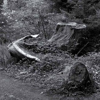
Welcome to our monochrome special - it is just three years since we introduced one for Professional Imagemaker and therefore timely that we revisit the topic. Although technology has moved on in the digital scene, the underlying strengths of the mono image are timeless. In essence it is about simplification of an image,the reduction to just tonal values of a single hue, without any distracting colours to disturb the gaze. Although this is a simple ideal, the practice is somewhat more difficult to achieve.
The eye is very much more sensitive to colour differences in neutral or near-neutral tones and any unwanted bias will be readily detected. Generally a bias towards green is the most unwelcome outcome, a preference that extends back all the way to Ansel Adams. In his book, The Print, Adams talks about toning a monochrome silver print to ensure that no residual olive tones remain:
'In my opinion the olive-greenish values of many papers detract from the image, but they can be neutralised by selenium toning.'
Some things never change. In the same book, Adams says, 'The subtle colour changes of toning are more apparent under tungsten lighting than in daylight'. Adams died in 1984, well before inkjet printing really took off and metamerism was already rearing its head!
So what else can monochrome bring to the digital table? Well, for starters you can mix mono and colour on the same page of an album spread (or poster or advert or design layout). This opens the possibility of allowing colour images space in which to speak out from or conversely colour can be used as a muted background to allow monochrome to excel in its difference.
As a means of artistic expression mono has always been highly valued. If you base any analysis on the most recent photography sales at Christies, the statistics are quite definitive. At the November 2008 auction a total of 127 lots were offered and 119 of these were sold for a total of almost £350,000. The highest price paid was for five, 1930s still lives by Willy Zilke at £16,250. Within the lots offered, 147 were monochrome (silver halide), 19 were described as chromogenic and two were Polaroids.
About 18 lots were images of naked or nearnaked females, seven were of naked or near-naked males (and male couples), 28 were of people recognisable by their name (eg, Kate Moss, Marilyn Munroe, Bob Dylan). At a later auction in New York a total of $1.3 million was realised in the Christie Icons of Glamour and Style auction. Top slot went to Helmut Newton at $242,500 for a large-scale monochrome diptych. Of 104 lots sold, 17 were in colour, again therefore the predominant medium was silver halide mono. From both these auctions only a handful (probably fewer than five) were inkjet.
We discuss fine art monochrome and collecting pictures with Eric Howard later in this issue, but for the moment we move on to the mechanics of digital monochrome.
Conversion to Monochrome
This is the key issue and we have modified the chat we made three years ago to bring it up to date. No apologies are made for the complexity of the chart; it shows it the way it is! It reveals just how many and varied are the options for making a monochrome from our coloured world and the problem for many is in making a choice. Everybody has their own pet way of making monochrome and usually defends their choice vigorously.
The breadth of this experience points to the fact that there are many successful ways of converting and that every image is likely to benefit from individual tweaks. Two general rules of photography remain if force though - fancy conversion techniques are unlikely to rescue a fundamentally flawed image and a busy professional needs a method that works quickly and reliably for most (if not all) of their images.
Today (and assuming you have access to either CS3 or CS4) Photoshop will do a great conversion directly from the RAW file. You have three options: to desaturate the image directly, a sophisticated HSL/Grayscale dialogue box or finally a Split Toning dialogue box. Desaturation is self-evident, you simply remove the colour. The other two we will describe. You should note that similar controls are available from the Adjustment Layer menu with the additional sophistication that you can control the places where the changes take place with a layer mask. There is also the thorny issue of whether to work in 8-bit or 16-bit - more on that later.
Monochrome - The Methods
"One of the problems of having so much horsepower to hand for the conversion process is the confusion it can cause..."
Introduction
The conversion to monochrome from our world of colour is a key element in this feature. The photographer has two choices at the outset: to shoot in colour or to shoot in monochrome. If they shoot in colour they then have to decide whether to transform to mono in Photoshop or to use a 'black ink' method and allow the printer driver to make the conversion.
A feature of today's mono scene is the demise of the 'quad' ink sets. For quad inks, the coloured ink sets are replaced by subtly coloured 'black' and 'grey' inks. The output is then controlled via a RIP or Photoshop curves to blend the tones to neutrality of a preferred light tone. The technique is still used by skilled enthusiasts to make fine art monochrome prints of exceptional quality. However, from a commercial point of view, the arrival of the Epson UltraChrome K3 ink set all but killed this market. It has done so by outperforming quads in terms of ease of use and quality, particularly in having lower metamerism. The struggle to keep nozzles from blocking is an ever-present issue with non-Epson inks, something the busy professional has hardly got time for.
The systems are still listed on the websites of both Permajet and Marrutt. The QuadTone RIP remains available from www.quadtonerip.com and works for both Mac and PC. It is a superbly coded product although you do have to invest in learning to use it well.
Outside of quad ink, the software surrounding monochrome creation has moved on since we last reviewed the topic as a whole. Photoshop has adopted the methodology originally proposed by their own Russell Brown and built it in to the RAW file handler, ACR. The HSL/Grayscale and SplitToning tabs offer a great deal of control.
The Image>Adjust>Black and White control is also greatly strengthened, again based on an ability to configure the monochrome values against the colour values in the original scene. The drop-down menu provides 12 pre-set adjustments to cover the complementary monochrome filters (eg red, oranges or yellows) along with infrared.
One of the problems of having so much horsepower to hand for the conversion process is the confusion it can cause as you try out dozens of options and an infinity of settings variations. Help is at hand from various kind people who have posted their efforts on the web.
Typical is the offering from DIYPhotography.net, created by Ladislav Soukep. The 5MB download is a Photoshop file and script. To use it you open the downloaded image, double click the big 'X' of the file, then place your own test file over this and scale it in the box. You then flatten the file, click the 'save' button and the script kicks into action to create a multichoice sheet showing variations. This provides an easy way of visualising the outcome and can shorten the path to adjusting your image. In 'reading' such results, old hands will be familiar with the use of complementary filters; youngsters, or the forgetful, should read the call-out box in this issue.

Commercial Solutions
Many commercial plug-in and software companies have sought to add utility of monochrome conversions with bespoke solutions of their own. Nik Software's SilverFXPro is typical, but one of the better offerings. We reviewed the product in October 2008 but we asked Tom Lee to provide some images and comments of his longer-term real-life use of the product.
RAW - HSL/Grayscale
When this panel opens you see the full colour image and there are sliders for adjusting Hue, Saturation and Lightness of the colour image. If you check the 'Convert to Grayscale' box these options are replaced by a Grayscale Mix slider set, in which the luminance contributions of the primary, secondary and some tertiary colours are controllable. This is a little like having the biggest complementary filter set in the world! Again, a knowledge of the way film, mono filters work is helpful in guiding you how to move the sliders, but you can, in truth, juggle with them until you like the result. Be warned though that you can spend hours playing about with the sliders.
The RAW file dialogue box opens with the image in full colour and from here you can adjust a colour image or choose to check the 'Convert to Grayscale' box. This changes the view to that shown in the middle screen grab. The primary, secondary and some tertiary colours may be adjusted to vary their contributions to the tonal Lightness values of the image. Although there are no pre-sets available from this menu, clicking on the blue link at the bottom reveals the workflow settings box as shown from where the bit depth, colour space and resolution may be varied.
The bottom screen grab shows the Split Toning dialogue panel. Here, different tones may be applied to, for example, the highlights and shadows, which mimics the effect that is possible with silver halide toning in which successive applications of different toners may be used to affect the image in the same way. The digital workflow has considerably more control!

Paying compliments to complements
- the filter etiquette
Long before digital photography, only mono film was available as it predated colour film by some time. The monochrome photographer was faced with an inability to easily control the way that sky (in particular) was rendered into the final print. Sky contains a lot of blue light, a wavelength to which the original negative emulsions were particularly sensitive. The result was 'washed out' featureless skies in landscapes, along with haze from reflected blue light in the atmosphere.
The solution was to place a yellow filter on the lens. This blocks the 'complementary' colour (blue) and prevents the blue light from unduly exposing the sky in the image. The result is slightly deeper tones in the whites of the clouds and darker 'blue' in the holes in the cloud. This, then, is the origin of the expression complementary filter - the complementary colour is the one that is darkened. Thus yellow darkens blue, red darkens cyan, etc.
A downside of the complementary filter was that although red creates a dramatically dark sky, it tends to render foliage far too dark and unrealistic. Similarly, if a person in a landscape was wearing a green jacket, the detail would be obliterated by the orange filter. One of the great benefits of digital conversion is that the filter effect can be applied then but masked out in areas where it is not required.
Regular contributors to Professional Imagemaker, Paul McMullin and Paul Gallagher and both devotees of the Lee Filter Systems which can be viewed at ww.leefilters.com. They make complementary filters along with graduated and polarising filters for most professional camera types including medium and large format.

Using Adjustment Layers
If you use the Black and White Adjustment Layer you have essentially the same tabs as the RAW file to Grayscale converter plus a couple of other options. A number of pre-sets are available called, for example, High Contrast orange which is useful if you have an idea of the conversion you require. Even if you run out of knobs to twiddle with the available sliders, you can activate the target adjustment mode button and then pick up a colour from the image and drag the mouse to the right for lighten and to the left for darken.
We stumbled upon a useful method of exploiting this feature which has nothing to do with monochrome. We had been trying with some difficulty to create a mask to enable us to balance a picture in a panel with another in terms of background tone. The image shown is of a Great Tit gathering sheep's wool from a barbed wire fence. The tangled wool presents a problem that is also common in making masks for frizzy hair. At first sight it looked easy, the green and white looked quite separate. In practice we had a lot of trouble getting a clean border between the wool and the green background.
Using the Black and White conversion as an adjustment layer and selecting the background green with the dropper, we darkened the background against the wool. We then applied Calculations in Multiply mode to enhance the effect and create a new channel. This channel was then painted to remove the bird and barbed wire and then used as a layer mask to adjust the Hue, Saturation and Brightness to match up the two images.
ABOVE: The difference is quite subtle but important for the overall harmony of a qualifications panel. On the left the tones of the background do not match, on the right they have been adjusted for a better match while leaving both the Great Tit and the wool unaltered.
BELOW: The annotated screen grab shows a Black and White Adjustment Layer in action. The layer shown at A brings up the pane shown at B where the colour selection icon is clicked to active and then moved to point C in the image. Now, when the mouse is dragged to the left as indicated, the greens darken and highlight the difference between the green foliage of the background and the sheep's wool on the barbed wire. This is the starting point for making and refining a mask.

Nik Software's Silver Efex Pro
Tom Lee investigates
Many third-party plug-ins have been provided by various manufacturers for all sorts of things, but rarely do they 'do what they say on the tin' or offer value for money. Although there are numerous ways to convert images to monochrome or black & white, (I've even developed some of them myself ), only one plug-in has performed for me the way I needed it to and offered me the ability to save or fine tune my selections to various types of images.mono 7
Nik Software produce several plug-ins for Photoshop, one of which is a dedicated monochrome conversion tool for producing black & white or toned images called Silver Efex Pro. If you already own other Nik software tools, the operating interface slots in under the other programs to keep them tidy. The inset shows Silver Efex under my Existing Colour Efex module in the floating palette. When the image you want to convert is live, then simply click the activation button in the palette to open the main interface.
At first glance it looks a complicated affair with more whistles and flutes than you can shake a stick at! However, Nik has provided some online tutorials, available from their website, to explain the interface and show you how to set various sections to accommodate your favourite way of working - much like the workspace in Photoshop. Silver Efex is quick and easy to use but ultimately customisable and you have the ability to save your settings as favourites, so it's almost as easymono 8 as clicking a button to achieve your result in seconds
The easiest way of doing a quick conversion is to choose a pre-set from the left-hand pane to get you in the right ball park with the central window showing your chosen result. If you like it just click OK and you're done. The other panes allow you to make subtle changes to the tonality, contrast, the emulation of red, orange or yellow filters and the heart of the system that sets it apart from other plug-ins - the Grain Engine.
Most Photoshop conversions to monochrome look very similar, no matter what method is used, however, Silver Efex utilises a Grain Engine to emulate the structure of many different types of film emulsions. There are several pre-sets built into the program for ease of use but careful use of the sliders can generate your own personal look. The usual method for getting the film look is to add noise from the Photoshop filter palette, however, Nik claim to have studied hundreds of film types and created a unique system to mimic that 'old fashioned' print feel.
The picture of Effie the trumpet player was taken on very high ISO (6400) and even on the Nikon D3 it has some noise in the shadow areas. The use of a high grain structure and harder contrast has masked what noise there was and the final print looks as though it was taken on a normal highspeed monochrome emulsion. The Boatman needed a more subtle treatment and therefore I used the Antique Plate, standard setting, but lowered the brightness and increased contrast to give me the desired effect.
The final verdict was a very user-friendly plug-in interface to give a wide variation in finished looks quickly and without the grief. A result!

B.P.P.A. LIMITED
The Society of International Nature and Wildlife Photographers (SINWP)
Clwyd Chambers, Clwyd Street, Rhyl, Denbighshire, LL18 3LA, UK
Company Reg 0392 2894 | VAT number 790 4289 05
Tel: 01745 356935
Corporate Partners


Newsletter: Subscribe here
SINWP Bird Photographer of the Year
London Photography & Video Show - Europe's Largest 'All-Welcome' Photographic Convention | Partner Societies | Privacy