

articles/Equipment/let-there-be-light
Let There Be Light
by Mike McNamee
The most frequent query to come up at printing and colour management seminars
is 'why are my prints darker than my screen?' This is an almost universal cry
for uncalibrated system users and has the same underlying cause - the screen is
too bright!
But this is actually only one side of the problem. Yes, your screen may be too
bright, but your print viewing conditions are likely to be too dark, thus
compounding the problem.
Now there is an international standard for this carry-on, called ISO 3664. This
was published in the 70s and has had two revisions, one in 2000 and the latest
ISO 3664:2009 was implemented in 2012. For the casual user, these things only
serve to confuse matters still further. This is especially true because the
standard's main target audience is printing press and press services. There is a
standard set-up specified for viewing prints and (almost as an afterthought) for
comparing prints against screen, soft proofs. The main thing that a press
operator is concerned about is the match between a hard-copy proof and what the
press is producing; throwing a monitor into the system only serves to complicate
matters.
Despite these reservations there are some things to be gleaned and taken on
board from ISO 3664. The illumination level of the viewing area should be at one
of two intensities, according to what you are doing. These are called P1 and P2
as follows:
"P1 Critical comparison of PRINTS
This is recommended when comparing an original and its reproduction, or when
comparing a sample print with a production run. The higher illumination level
enables better judgment for evaluation of higher density zones (shadows). The
illumination
level is 2,000 lux at print level.
However, it is also recommended to make a comparison with the P2 conditions, or
the actual conditions that will be used to view the images, to get an overall
view of tone reproduction.
P2 Practical appraisal of PRINTS
This is recommended when one wants to make a judgment on individual prints. This
viewing condition is not recommended for comparing prints against one another,
with the exception of comparing a print with its image shown on a monitor. The
lower illumination level of P2 makes this task easier. You should be aware that
such a comparison, monitor vs print, should only be performed when the monitor
and print viewing light have the SAME white point, usually D65 or D50. The
illumination level is 500 lux at print level."
In practice the main difference you will notice is that you can see more shadow
detail at the higher luminance viewing level.
The standard specifies that the screen luminance of your monitor should be
between 75 and 100 cd/m2. Some calibration software calls up 120cd/m2 for
laptops. Personally we like 75cd/m2 - apart from anything else it extends the
life of the monitor! This rather low value should be compared with the figures
that are bandied about for iPads, Macbook Pros and some low-end monitors of up
to 400cd/m2. This is the most common finding for those who suffer prints that
are dark compared with their screens - they are working at the default
luminance. The prime requirement for a screen calibrator and its software is
that you can choose and regulate the screen luminance AND check it afterwards!
Often luminance settings are under 'advanced' buttons or 'pro mode'. The current
rash of Retina screens have only served to make matters worse - they are never
going to look like a print!

Light Quality
For critical applications the quality of the light is important. This is
measured by a parameter called the Colour Rendering Index, the CRI. The sun has
100% CRI, as do incandescent bulbs such as tungsten and tungsten halogen; this
is essentially perfect. The colour temperature also has to be chosen and
correctly set. For viewing and setting up monitors the two main values are D50
and D65. Things now get complicated; D65 light is not just a colour temperature
of 6,500°k but also includes a specified amount of UV in its spectrum (the same
goes for D50 and 5,000°k). This is so the level of excitation caused by the UV
onto optical brightening agents is under control - it is also the major
difference between the 2000 and 2090 editions of ISO 3664. Practically the
effect is that D65 produces more reaction from OBAs than it used to, and so any
papers with OBAs will appear more blue. This is important because most proofing
papers do not contain OBAs but most papers used in press printing do, an anomaly
the industry has always had to deal with. However, screens have no OBA effect
within them and so the printed page is likely to look different to the screen
for this reason alone! As if this were not complicated enough, the CRI also
influences metamerism and so this has to be tied down as well - if you are not
ready to throw the towel in yet you soon might be! A final thing to bear in mind
is that D50 looks very yellow to the eye and although you rapidly get used to
this, if you are switching about from sunlight to D50 it looks alarmingly
yellow. D65, on the other hand, is quite cool and if you are moving about an
office or domestic environment it can look very cold. For this reason some users
(and this includes Professional Imagemaker) use around 5700°k. This sort of
quirk can drive fanatics to distraction, but they also have their walls painted
neutral grey to go with a grumpy wife!
Go back now to the start of this feature - 'the print is darker than the
screen'; this is perhaps what really matters to photographers, they mainly do
not require to colour match, just to create a pleasing colour balance. Providing
the metamerism is not so high as to distort monochromes then a lower standard of
CRI/metamerism might be acceptable providing it is the correct brightness.
To cut through all this, the user needs specific advice:
- Use a monitor calibrator but get one which sets and checks the luminance value and also checks the residual colour error when you have finished. A simple before-and-after toggle screen is not helpful - you need to know.
- Set your monitor to 75cd/m2 and your viewing area to 500 lux. A compact fluorescent tube as described in the call-out will give 6500°k and 500 lux at about 2 feet distance. These tubes have a CRI of about 86% - outside of the specification, but OK for most screen-to-printmatch purposes. If you need to match two prints closely you can drop the angle-poise down to 14-inches and have a better look at the shadows!
- Take your time when assessing prints, but try to make your colour changes in ACR and Photoshop quite quickly as prolonged knob twiddling invariably leads to errors - give it long enough and you will fully adapt to any colour! For similar reasons two sets of eyes are better than one, get a partner or colleague to look over your shoulder every now and again (in photographic competitions this is sometimes called a judge, but they appear too late on the scene).

Maybe the Print is Wrong?
In our experience all printers from the Epson 3880 upwards (ie larger) are very
accurate and only rarely are they the source of a print-screen mismatch (they
are, in fact, calibrated before they get to you). Even so, you might be unlucky
or even be printing incorrectly. Not using colour management can mess your
prints up very considerably, so always double check; make sure your Photoshop
settings are 'sticking' (just going back and changing a parameter in 'Print
Settings' can switch you from 'Photoshop Manages Color' to 'Printer Manages
Color' with disastrous results. Always have Black Point Compensation turned on,
not doing so will clog up your blacks and shift print contrast.
How Good Does It Get?
How good can you match a print to a screen and vice versa? We have previously
set up blind tests in which the subject has to look at a print and change the
brightness until the print and screen match. Our findings suggest that
inexperienced operators get within �6% in Lab brightness values but after a few
minutes they can achieve �2% simply because they become more tuned to watching
(the values for a 50% grey patch). This is quite close and is certainly as close
a call as the photograph's printer might make in terms of preference. For
example �2% is one whole increment in the Advanced Black and White driver and
one user might prefer a Normal setting for a print, while another might prefer
Dark. Subject to the dangers of the magazine printing press, we show here what
this looks like on the reference print.
For the record the tests were conducted using a Fogra Class A certified viewing
booth and monitor. The reference print was made so that the mid-tone patch was
exactly 50% density on the Lab scale. When tested the subjects were only able to
see the print and screen, the colour data was hidden from them. They were not
shown the results until the end of the trials.

Expert's Corner
There is a hierarchy of spending on print viewing according to how fanatical you
wish to be. We can draw up a table:
In terms of fluorescent tube alone you start at £5.50 for a compact fluorescent
860 and run up to a Phillips TLD 950 at about £11 ex-fittings (2-foot tube) then
away to as much as £75 for a certified tube from the likes of Just Normlitch.
Calibrators
The i1 Display Pro should be your opening bid as it validates the
calibration afterwards - you really do need to know where you are.
The i1 Photo Pro 2 calibrates monitors, prints, and projectors, and measures
light quality. It is limited to RGB profile making and does not contain the
industry-standard Fogra/Ugra test for contract proof compliance - for that you
need i1Publish at £1,910.
Additionally if you need light testing to ISO 3664 you need software such as
BabelColor CT&A at $125. This drives your i1 Pro 2 and provides endless fun for
colour geeks!
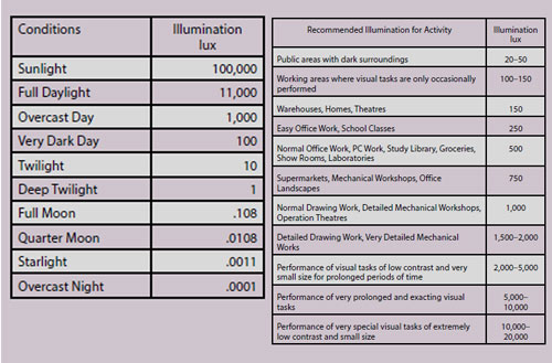
Lux
No this is not a bar of Unilever soap! It is the measure of 'luminance', which
in layman's terms is how bright the light falling on a print actually is. The
main barrier to people understanding the meaning of a lux and what it might
represent is the fact that it is a logarithmic scale (sound of people diving for
cover!). In truth it is not that bad and in most respects is similar to the
concept of an f-stop. Thus a change from 140 lux to 1,400 lux is not an
apparent, visual increase of 10 times, it's more like four stops of photographic
brightness. The fact that the eye can operate in 1/10th lux (moonlight) and also
in 100,000 lux (sunshine) is a testament to the quality of the human design and
even though it is difficult to imagine a range of one million to one in lux, it
is a much more manageable number of f-stops! The best way to grasp the size of a
lux is to look at typical values in the table.
LED Lighting Panels
In the McNamee household, Compact Fluorescent Bulbs have a very bad press. They
take an age to warm up and remain quite dull even then. They are supposed to
outlast tungsten bulbs (ie old-fashioned globes) many times but in reality we
find ourselves changing them with equal frequency. The metamerism from them for
print viewing is horrendous and we have recorded CRIs as low as 37 on the really
cheap and nasty ones from places such as B&Q. They also carry onerous disposal
requirements if you follow the letter of the law.
When they first came out LED replacement bulbs we very cold and very directional
so much so that they were rejected by senior management of the household for the
new kitchen. Today this is changing rapidly and the latest domestic light panels
and LED globes we tested are really rather nice!
The Hispec panels are 595x595mm and just 10mm thick. They run off a small
transformer to deliver 3,000 lumens at a colour temperature of 4,000K. Our own
tests confirmed the CRI as 80+ and the panel delivered a little over 2,000 lux
at 1 metre distance. You could easily build the panel into the top of a grey
'box' to form an excellent viewing area even though 4,000K is away from any of
the normal standardised viewing temperatures. However, 4,000K is now regarded as
the 'office' standard in many places and so you would be viewing at a realistic
environment colour temperature for many applications.
At under £50 you can see lots of uses in the photographic studio for lighting
applications also. As panels for product lighting they offer interesting
possibilities.

B.P.P.A. LIMITED
The Society of International Nature and Wildlife Photographers (SINWP)
Clwyd Chambers, Clwyd Street, Rhyl, Denbighshire, LL18 3LA, UK
Company Reg 0392 2894 | VAT number 790 4289 05
Tel: 01745 356935
Corporate Partners


Newsletter: Subscribe here
SINWP Bird Photographer of the Year
London Photography & Video Show - Europe's Largest 'All-Welcome' Photographic Convention | Partner Societies | Privacy