

articles/Software/black-white-digital-darkroom
The Black and White Digital Darkroom
by Paul Gallagher

It is without doubt that black and white photography has a strong
place in the world of image making today and I suspect this will always
be the case. If we consider the photography magazine market, which is a
very competitive environment, there remain several titles throughout the world
that are entirely dedicated to the celebration of black and white photography. When
we take a look at social media, or conduct a web search on the subject, we are inundated
with societies, forums and groups who are in constant conversation about a subject that
was 'apparently' superseded in the early seventies. Lastly, the giants in the photographic
industry have not left black and white behind at all; virtually all cameras and capture
devices have some form of monochrome setting to enable the photographer
to peer into the wonderful world of black and white, allowing them to see
what they had seen in full colour only moments before, represented in
a series of tones of grey. Almost all image manipulation software
dedicated to the post-capture segment of the photography
market has attributed time and money in ensuring
that photographers have access to exploring their
photographs without colour. Many printers
also have dedicated monochrome
drivers sometimes using different
combinations of their ink set.
Converting to Black and White
One of the most important parts of the black and white
photography process is converting your image to black and
white using your computer. There are many ways in which to
do this but I will cover the basic methods here so that we keep
things as straightforward as possible. In Adobe Lightroom
the first port of call is in the Develop Module and if you then
look down this menu you will see the dialogue box HSL/Color/
B&W. If you then click on the B&W you will see your image
turn black and white and you will see a list of different colour
sliders available to you. These sliders relate to the colour in
the original colour Raw file and it is here that you can explore
various colours rendered in tones of grey (See image right).
If you are using Adobe Camera Raw (ACR) when you first open your camera Raw file it will automatically open in ACR. When you have done this you will see a menu bar positioned below the histogram in the upper right-hand side of your screen. As with Lightroom, if you then click on HSL/Greyscale, and then click on the 'Convert to Greyscale' box you will see that your image will turn black and white. Once again you will have the same set of colour sliders as in Lightroom (See image left).
If you decide to convert to black and white using Photoshop, the best way with the most flexibility is by creating a black and a white conversion layer which will present you with the same set of colour sliders in a dialogue box (See image right). I must say at this point that you are just beginning to 'shape' your image into a finished black and white photograph and you should not try to achieve every tonal adjustment at this stage. Also, if you 'push' and 'pull' some of the colour sliders too much you will run the risk of making your image look 'crunchy' by driving colours into clipping.
Contrast and Tones
Even after more than 30 years of making black and white
photographs, I have only had a handful of images that
have not needed localised adjustments. In the darkroom
days we called this 'dodging' and 'burning' which meant
we lightened and darkened separate parts of the
photograph to bring out the light and tones that we
saw when we were out there with our camera. We
must remember that a digital camera can only
do so much for us and it is up to us to bring
out the drama or three-dimensionality of
the photograph in the final stages. You can
make this process as complicated as you
like but what I will set out here are a few
basic ideas to follow.
If we begin with Lightroom, after
we have made our conversion to
black and white you will still be
in the 'Develop' module using
the adjustment brush. When
you click on the brush icon
a palette will open (See
image left).
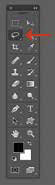
By adjusting the size feather of your adjustment brush you can explore how the individual sliders alter the smaller areas of tones in your image as opposed to being confined to global image adjustments. If you are using Photoshop to adjust areas of your image then I think it is best to keep things as simple as possible rather than making things unnecessarily complicated. The method I have used for many years involves using simple selections and curves. I find the easiest way to make a selection of an image is with the Lasso tool (See Image right).
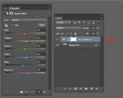
As with Lightroom we can set the size and feather of our lasso and make individual selections of various parts of our image. When you have made your selection you then choose a new Curves Adjustment Layer in the Layers palette (See image left).
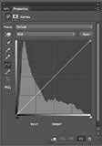
The Curves dialogue box now appears and consists of two axes which gradually transform from solid black to solid white and a diagonal line (See image right). One end of the line represents white and the other represents black. If we click on any part of that line and drag it up or down we will begin to alter the tones in our image. For example, if we push the line upwards we will lighten the chosen selected area and if we pull the line downwards we will darken the area we have selected. If we make an 'S' shape we will increase contrast and if we make a reverse 'S' shape we will lower contrast in the rocks of this example. With these simple controls we can do all that we ever did in the darkroom and we have an amazing amount of flexibility to explore all the tones in our black and white photographs. All that remains is to try this technique out as often as you can whilst altering the feather of the section according to the portion of the image you are intending to alter. If this process is followed you can, with a little practice, have a finished image whereby the tonal adjustments you have made, are not obvious, but the image has come to life during the process.
Advanced Settings
Monochrome specialists have always toned
their prints to create subtle colour undertones
to their prints. The Advanced print dialogue
panel contains a colour wheel and alongside
this are input boxes for 'Horizontal' and 'Vertical'
values. These shift the base tone of the image. The
ABW driver eliminates full cyan and full magenta inks
from the printing mix but allows the use of yellow,
light magenta and light cyan so that subtle tones can
be created. This tool is subtle to use; a shift of 10 points
Horizontal or Vertical creates a just detectable change in
print tone so use at least five points when adjusting. Mike
McNamee has created a ring-around image of the settings
using values of 20 and 50 points around the colour wheel as a
guide.
Making the print
After many years of darkroom printing, the closest thing I have ever come to in terms of a
black and white darkroom
print is using the Epson
UltraChrome K3
inset and the Epson
Advanced Black
and White Driver.
After you have
resized your
image and
sharpened
for output
then you
can
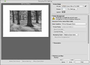
access the driver by clicking on File>Print. This will bring up
a Photoshop Print Settings box. From here you must set
the Colour Handling to 'Printer Manages Colours'. At the
same time you will see that the Printer Profile options
are greyed-out. The reason for this is we do not want
to use a full colour profile, we are opting to use the
Epson Advanced Black and White Driver (See Image
right).
When you have done this click on Print Settings
and from the Print dialogue box change Colour
to Advanced Black and White Photo (See image
left). If you now click on Advanced Colour Settings next to Basic you will see the Advanced Black
and White Driver menu for the first time.
From here I would suggest that you begin with the Dark
or Darker setting in Tone Options and leave all the other
controls alone. The thing to do here is not to begin to
try to fine tune your image using the small thumbnail
of the girl as all of your tonal adjustments should have
been completed before you have reached this stage. I
recommend that you begin with your favourite paper
media for your monochrome work and use a piece of
A4 in the printer to make a print. If the resulting print
is a little too dark or too bright, just alter the Tone
setting accordingly (each increment in the Tone
setting shifts the mid-grey tone by 4%). From my
experience, within a few sheets of paper you will
have a beautifully neutral black and white print.
The other settings, Brightness down to Highlight Point Shift are best left alone; your corrections
should ideally have been carried out ahead of printing. However, if you are troubled with 'bald'
patches on your highlights the Highlight Point Shift will add a small amount of ink, known as
a 'scum dot' in the trade. This has the effect of dulling the print slightly but if the print is to be
placed under a window mount the viewer will be unaware of it - you take your money and
make your choice!
Conclusions
The masters of black and white photography managed to produce
some of the world's most famous photographs in traditional
darkrooms using only pieces of card and cupping their
hands. As I said at the outset, you can make this
process as complicated as you like but from all
of my years of experience, I see little need
and you can make exhibition-quality
black and white prints and enjoy
doing it at the same time. In
short, practice makes
perfect!

B.P.P.A. LIMITED
The Society of International Nature and Wildlife Photographers (SINWP)
Clwyd Chambers, Clwyd Street, Rhyl, Denbighshire, LL18 3LA, UK
Company Reg 0392 2894 | VAT number 790 4289 05
Tel: 01745 356935
Corporate Partners


Newsletter: Subscribe here
SINWP Bird Photographer of the Year
London Photography & Video Show - Europe's Largest 'All-Welcome' Photographic Convention | Partner Societies | Privacy